
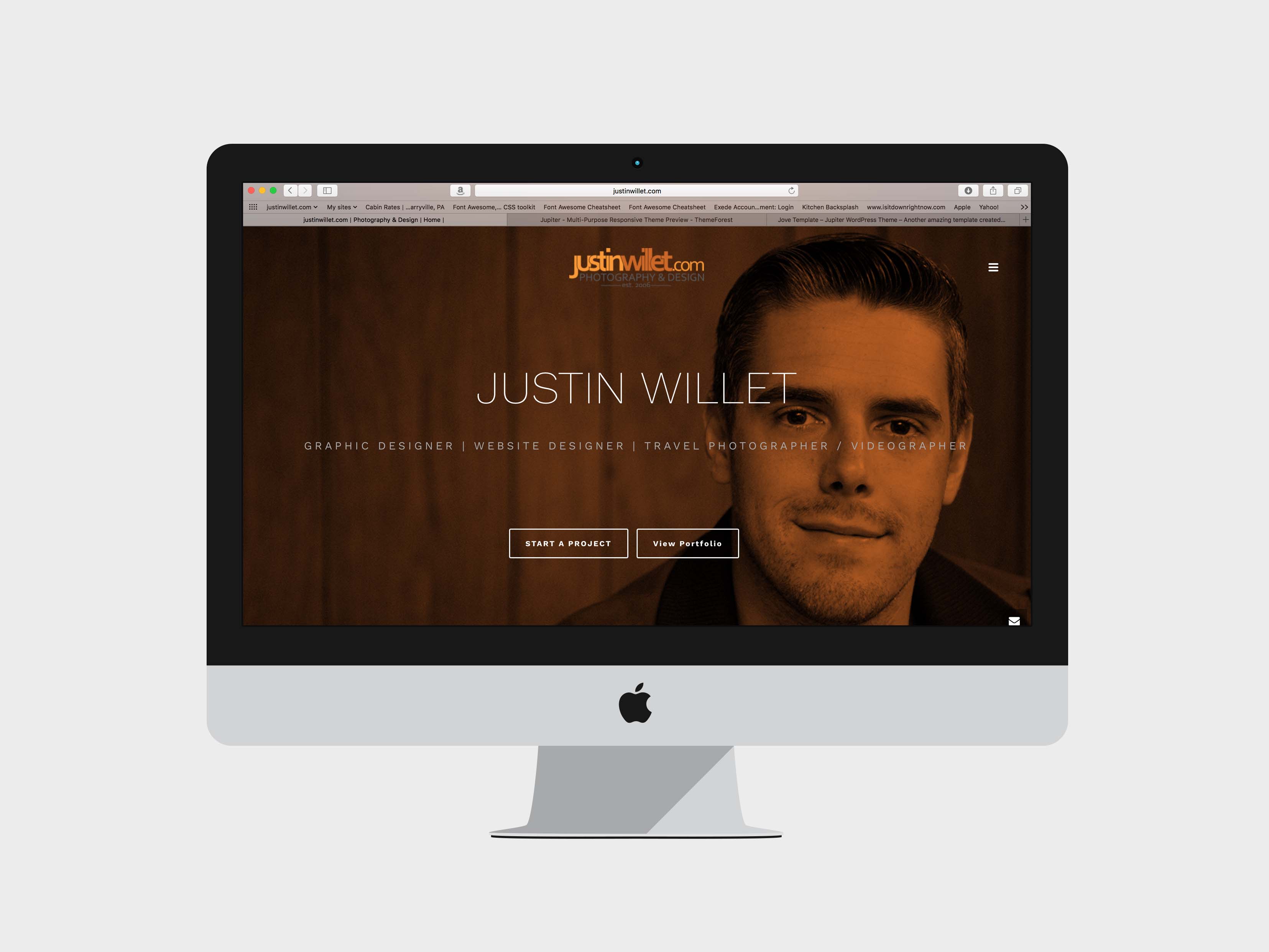
CASE STUDY: justinwillet.com website design
I set out to design the best version of justinwillet.com that there has ever been. Everything you now see is well thought out and serves a specific purpose. Below I walk you through my thought process behind the new design.
Better serve visitors by using strong visual content to convey exactly what services I offer.
After conducting a content audit of my website I realized that not all of my services were accurately described. I hoped to improve this by adding a complete “services” section which outlines the 4 main areas. View “services” here: Services. I’ve also created specific page breaks that highlight some unique aspects of my business.


Expand my website with detailed portfolios and additional gallery functionality.
Two years ago my portfolio was not nearly as diversified as it is today. I needed an easy way to add new projects and a beautiful way to display them. In addition to adding new portfolio categories and detailed descriptions, I’ve added a separate gallery page which features photo albums from past trips and concerts. This is one area I hope to continue expanding slowly over the next couple of weeks.
Improve blog pages.
Blogging is one of the best ways to share current projects, trends and plans for the future. When I designed my old site I wasn’t originally sure how much blogging I would be doing, so the design of that section was almost an after thought. This made posting new content very time consuming and required a lot of coding for each post. I hope you find the new blog pages very user friendly and easy to navigate. Check out a new blog here: http://justinwillet.com/blog/facebook-ads/
Make it easier for people to contact me and walk them through what to expect.
Periodically I review my website from an outsiders perspective and critique areas that I think could be improved. One big concern I had was that my old website was lacking clear direction on how to start a project. I offer a variety of services, so the first step is normally to open a line of communication. In order to improve in this area I’ve added a scrolling contact button on the homepage so that at any point you can initiate a conversation.
Practice what I preach.
As a rule of thumb you should consider redesigning your website about every 2 years. The internet is rapidly evolving and a lot can change in 2 years. You may not always require a complete facelift but you should at least evaluate the pros and cons of your existing website. My previous site was approaching the 21 month mark so I knew it was time to start working on an overhaul.
Recommended Posts

Comments

This is an awesome article Justin! Thank you for sharing 🙂